Integrating an Icon Library to a Vue Application
Icons are an essential part of any enterprise application. They can be used to represent actions, concepts or data and improve the overall…

Integrating an Icon Library to a Vue Application
Icons are an essential part of any enterprise application. They can be used to represent actions, concepts or data and improve the overall user experience by adding visual flair and clarity.
There are many different icon libraries available. Some popular options include Bootstrap Icons, Font Awesome, IcoMoon, Feather Icons, Vue-Material, and Vue-Unicons. In this article, we will use Bootstrap Icons as it is the most popular one, and they can be used independently without using the whole Bootstrap UI Library, but the integration would be similar for any other option.
Installation
To add Bootstrap Icons to an existing project using npm paste the following in the terminal:
npm i bootstrap-iconsAlternative commands:
_yarn add bootstrap-icons_or_pnpm add bootstrap-icons_
If you dont have an existing application you can create a new one using
npm create vite@latest vue-icons — — template vue
There are many different techniques for integrating the library into our application like sprites, external image sources, icon fonts, inline embed and background image using CSS. We will use the [SVG sprite technique](https://www.sitepoint.com/use-svg-image-sprites/).
Let’s create a component called AppIcon.vuewith the following contents:
<!-- AppIcon.vue -->

<script setup>
import BootstrapIcons from "bootstrap-icons/bootstrap-icons.svg";
</script>

<template>
  <svg width="32" height="32" fill="currentColor">
    <use v-bind:xlink:href="`${BootstrapIcons}#$shop`" />
  </svg>
</template>
The result is a 32-pixel shop icon.

That was easy, but our component is not yet dynamic. We should be able to configure the image, colour and size of our icon. We can do this using props.
Let’s start with the image.
Notice that in the example above we are importing the shop icon from the SVG sprite which has the following format:
<svg>
  <defs>
    <g id="shop">
      <!-- all the paths and shapes for the shop icon -->
    <g>
    <g id="pencil">
      <!-- all the paths and shapes for the pencil icon -->
    <g>
    <!-- etc -->
  </defs>
</svg>
Any of the [available icons](https://icons.getbootstrap.com/?#icons) of the library can be used. All we have to do is make that part dynamic using a prop.
<!-- AppIcon.vue -->
<script setup>
import BootstrapIcons from "bootstrap-icons/bootstrap-icons.svg";

defineProps({
  icon: {
    type: String,
    required: true,
  },
});
</script>

<template>
  <svg width="32" height="32" fill="currentColor">
    <use v-bind:xlink:href="`${BootstrapIcons}#${icon}`" />
  </svg>
</template>
<!-- App.vue -->
<AppIcon icon="pencil" />
<AppIcon icon="medium" />
<AppIcon icon="send" />
We can do the same for the colour if we want to restrict the available colours to a specific palette. If not, we can leverage fill as a [fallthrough attribute](https://vuejs.org/guide/components/attrs.html) for a cleaner approach.
<!-- App.vue -->
<AppIcon icon="pencil" fill="#45FFCA" />
<AppIcon icon="medium" fill="#78C1F3" />
<AppIcon icon="send" fill="#D67BFF" />
Fall-through attributes would also work for the size, but it is common for sizes to be restricted to a list of predefined options. That’s why we will use a prop, that will control a class which can be targeted with CSS.
<!-- AppIcon.vue -->
<script setup>
import BootstrapIcons from "bootstrap-icons/bootstrap-icons.svg";

defineProps({
  icon: {
    type: String,
    required: true,
  },
  size: {
    type: String,
    default: "md",
  },
});
</script>

<template>
  <svg class="icon" :class="`icon-size-${size}`">
    <g transform-origin="center">
      <use v-bind:xlink:href="`${BootstrapIcons}#${icon}`" />
    </g>
  </svg>
</template>

<style scoped lang="scss">
.icon {
  width: 1em;
  height: 1em;
}
.icon-size {
  &-sm {
    font-size: 0.75rem;
  }
  &-md {
    font-size: 1rem;
  }
  &-lg {
    font-size: 1.5rem;
  }
  &-2x {
    font-size: 2rem;
  }
  &-3x {
    font-size: 3rem;
  }
  &-4x {
    font-size: 4rem;
  }
  &-5x {
    font-size: 5rem;
  }
}
</style>
[Sass](https://sass-lang.com/)is used since its the intrustry standard, but CSS would also work. Installation with_npm install -D sass-loader sass_
We are using the [font-size SVG sizing technique](https://css-tricks.com/control-icons-with-font-size/) by setting the SVG width to 1em and controlling the size of each modifier using the font-size property. The specific font sizes can be adjusted to match your design system.
<!-- App.vue -->
<AppIcon icon="pencil" fill="#45FFCA" size="2x" />
<AppIcon icon="medium" fill="#78C1F3" size="4x" />
<AppIcon icon="send" fill="#D67BFF" size="lg" />
Adding TypeScript
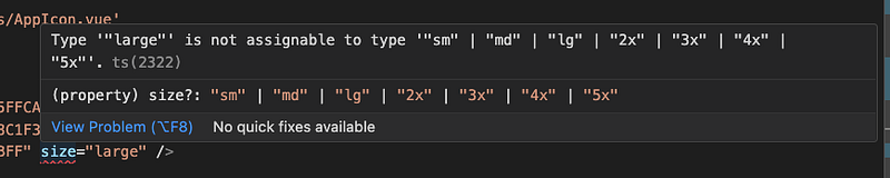
Our component is now dynamic and works well but the following incorrect usage of the size prop is permitted.
<AppIcon icon="send" size="large" />We can [convert our component to TypeScript](https://stackoverflow.com/questions/63724523/how-to-add-typescript-to-vue-3-and-vite-project) and leverage an enum to prevent wrong usage.
<script setup lang="ts">
import BootstrapIcons from "bootstrap-icons/bootstrap-icons.svg";
import { PropType } from "vue";

enum IconSizes {
  "sm",
  "md",
  "lg",
  "2x",
  "3x",
  "4x",
  "5x",
}

defineProps({
  icon: {
    type: String,
    required: true,
  },
  size: {
    type: String as PropType<keyof typeof IconSizes>,
    default: IconSizes.md,
  },
});
</script>

<template>
  <svg class="icon" :class="`icon-size-${size}`">
    <g transform-origin="center">
      <use v-bind:xlink:href="`${BootstrapIcons}#${icon}`" />
    </g>
  </svg>
</template>

<style scoped lang="scss">
.icon {
  width: 1em;
  height: 1em;
}
.icon-size {
  &-sm {
    font-size: 0.75rem;
  }
  &-md {
    font-size: 1rem;
  }
  &-lg {
    font-size: 1.5rem;
  }
  &-2x {
    font-size: 2rem;
  }
  &-3x {
    font-size: 3rem;
  }
  &-4x {
    font-size: 4rem;
  }
  &-5x {
    font-size: 5rem;
  }
}
</style>
In case of a misusage, the IDE will warn us with a helpful message.
Conclusion
So here we go, a simple and reusable icon component that uses bootstrap-icons sprite behind the scenes and encapsulates the complexity of icon sizes.
The code examples are available on GitHub.


ⓘ This article is part of a Base Component Implementation series:
Any recommendation for future additions? Please leave a comment below.