Vue 3 Real Life Transitions and Micro-Interactions
Vue provides a simple and elegant way of handling animations. You can easily apply them by adding a <transition /> directive that does all…

Vue 3 Real Life Transitions and Micro-Interactions
 Vue provides a simple and elegant way of handling animations. You can easily apply them by adding a
 _<transition />_ directive that does all the heavy work for you. Or you can leverage the javascript hooks to incorporate more complex logic into your animations and maybe add third-party libraries like [gsap](https://greensock.com/gsap/) for even more advanced use cases.
In this article, we will investigate these different options but first, let’s leave Vue.js on the side for the moment and talk about the differences between CSS Transitions and Animations.
Transitions Vs Animations
Transitions are performed between two distinct states. The start state and an end state. Like a modal component, the start state could be hidden, and the end state could be visible. You set up those states, and the browser fills in that state change with a sequence of in-between frames.
button {
  background-color: #0ff1ce;
  transition: background-color 0.3s ease-in;
}
button:hover {
  background-color: #c0ffee;
}
If you want to perform something that does not explicitly involve a start state and an end state, or you need more fine-grain control over the keyframes in a transition, then you’ve got to use animation.
button:hover {
  animation-duration: 3s;
  animation-iteration-count: infinite;
  animation-name: wobble;
}

@keyframes wobble {
  0%,
  100% {
    transform: translateX(0%);
    transform-origin: 50% 50%;
  }

  15% {
    transform: translateX(-32px) rotate(-6deg);
  }

  30% {
    transform: translateX(16px) rotate(6deg);
  }

  45% {
    transform: translateX(-16px) rotate(-3.6deg);
  }

  60% {
    transform: translateX(10px) rotate(2.4deg);
  }

  75% {
    transform: translateX(-8px) rotate(-1.2deg);
  }
}
Which will result in the following:
The possibilities with animations are endless if you consider that many properties can be animated, multiple animations can be applied to an element, and javascript can be used to control them.
To learn more, read about using CSS animations (MDN) and play around with this [CSS animation generator](https://webcode.tools/generators/css/keyframe-animation).
Vue.js transition directive
Both transitions and animations can easily be used in a Vue.js project by using the built-in transition directive. Vue will add the appropriate classes to the enclosed elements during the animation process.
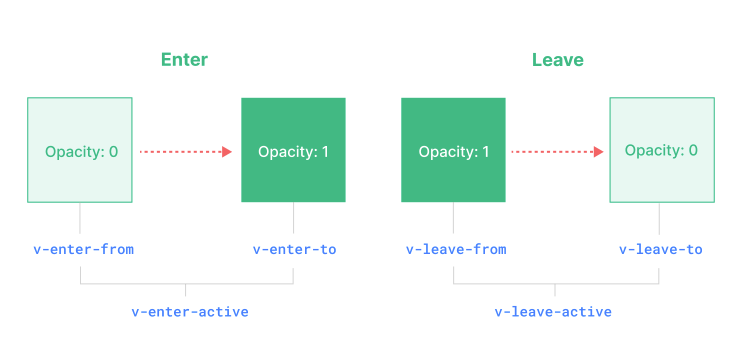
Transition Classes
Enter
v-enter-from: Starting state.v-enter-active: Active state. Applied during the entire animation phase.v-enter-to: Ending state.
Leave
v-leave-from: Starting state.v-leave-active: Active state for leave. Applied during the entire animation phase.v-leave-to: Ending state.
In case of a named transition, the name replaces the v- prefix.
This was somewhat confusing to me initially, but everything will be easier to understand when we dive into the code. Let’s start with the examples.
Animation Examples
Some trivial parts of the markup are ommited for brevity but everything including a live demo is available on
[github](https://github.com/fadamakis/vue-animations).
Toggle with Fade Animation
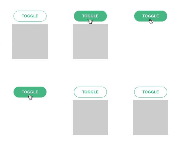
<button @click="toggle">Toggle</button>
<transition name="fade">
  <div class="box" v-if="!isHidden"></div>
</transition>
.fade-enter-active,
.fade-leave-active {
transition: opacity 0.3s;
}
.fade-enter-from,
.fade-leave-to {
opacity: 0;
}Toggle with Slide Animation
.slide-enter-active {
  transition-duration: 0.3s;
  transition-timing-function: ease-in;
}

.slide-leave-active {
  transition-duration: 0.3s;
  transition-timing-function: cubic-bezier(0, 1, 0.5, 1);
}

.slide-enter-to,
.slide-leave-from {
  overflow: hidden;
}

.slide-enter-from,
.slide-leave-to {
  overflow: hidden;
  height: 0;
}
Toggle Between Two Buttons
<transition name="fade" mode="out-in">
  <button @click="toggle" v-if="!isHidden" key="first">First State</button>
  <button @click="toggle" v-else key="second">Second State</button>
</transition>
.fade-enter-active,
.fade-leave-active {
transition: opacity 0.3s;
}
.fade-enter-from,
.fade-leave-to {
opacity: 0;
}Toggle Between Two States
.bounce-enter-active {
  animation: bounce 0.3s;
}
.bounce-leave-active {
  animation: bounce 0.3s reverse;
}

@keyframes bounce {
  0% {
    transform: scale(1);
    opacity: 0;
  }
  60% {
    transform: scale(1.1);
  }
  100% {
    transform: scale(1);
    opacity: 1;
  }
}
List Add, Remove & Shuffle
.list-enter-active,
.list-leave-active {
  transition: all 0.3s;
}

.list-enter-from,
.list-leave-to {
  opacity: 0;
  transform: scale(0);
}

/\* Shuffle \*/
.list-move {
  transition: transform 0.6s;
}
Modal
.modal-enter-from {
  opacity: 0;
}

.modal-leave-active {
  opacity: 0;
}

.modal-enter-from .modal-container,
.modal-leave-active .modal-container {
  -webkit-transform: scale(1.1);
  transform: scale(1.1);
}
Card Animation
/\* moving \*/
.slideLeft-move {
  transition: all 0.6s ease-in-out 0.05s;
}

/\* appearing \*/
.slideLeft-enter-active {
  transition: all 0.4s ease-out;
}

/\* disappearing \*/
.slideLeft-leave-active {
  transition: all 0.2s ease-in;
  position: absolute;
  z-index: 0;
}

/\* appear at / disappear to \*/
.slideLeft-enter-from,
.slideLeft-leave-to {
  opacity: 0;
}
Expand/Collapse Animation
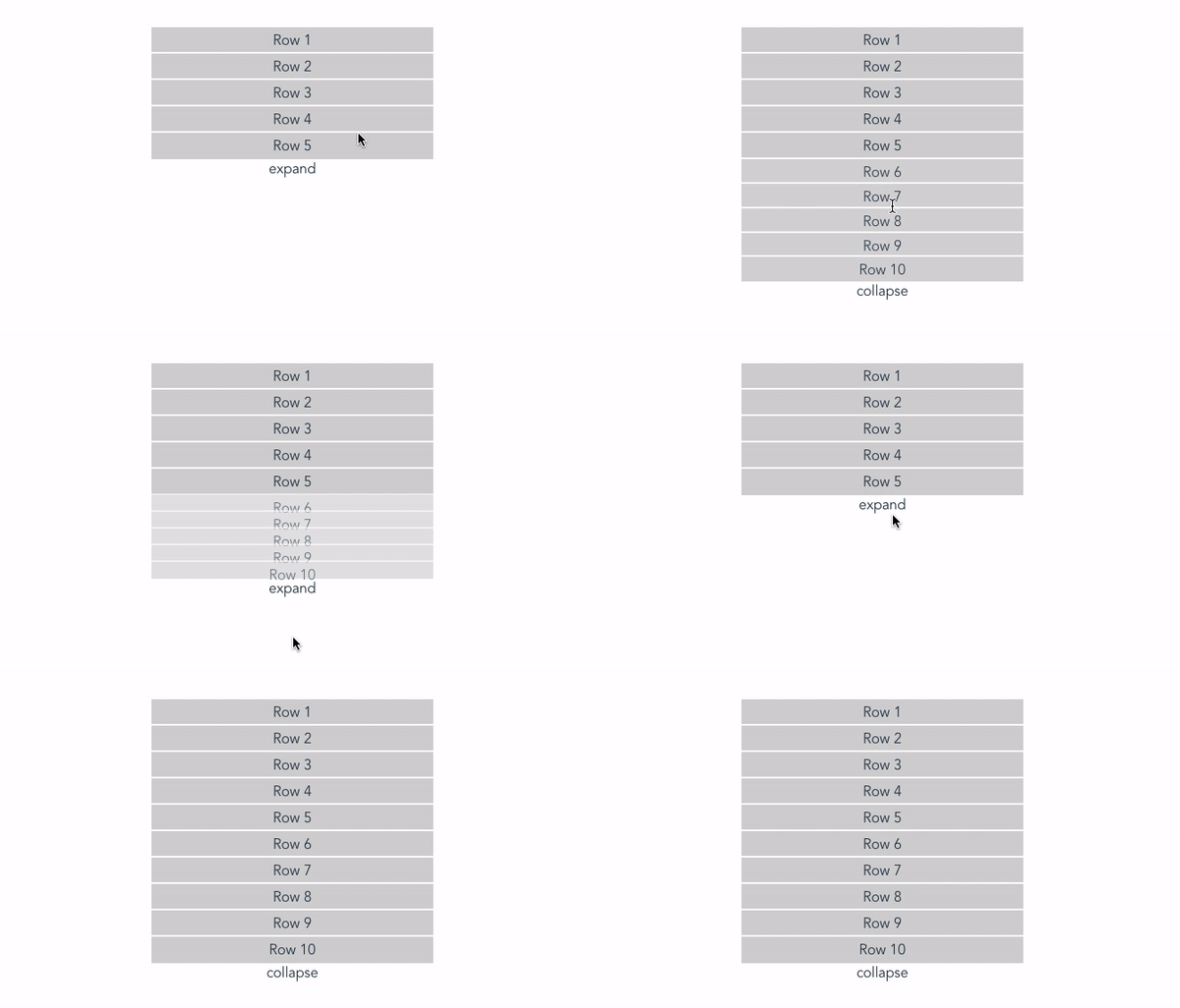
.list-enter-active,
.list-leave-active {
  transition: all 0.5s;
}
.list-enter-from,
.list-leave-to {
  opacity: 0;
  height: 0;
}
Progress Animation
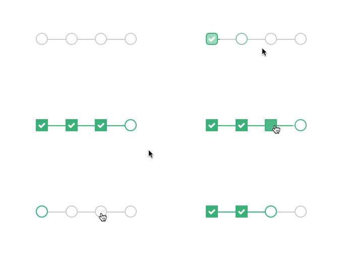
<div class="progress-steps">
  <div class="progress">
    <div class="percent" :style="{width: `${ (progress-1) \* 30 }%`}"></div>
  </div>
  <div class="steps">
    <div
      class="step"
      v-for="index in 4"
      @click="setProgress(index)"
      :key="index"
      :class="{'selected': progress === index,
     'completed': progress > index }"
    ></div>
  </div>
</div>
.container {
position: relative;
margin-top: 100px;
}
.progress-steps {
position: absolute;
top: 50%;
left: 50%;
transform: translate(-50%, -50%);
}
.steps {
position: relative;
display: flex;
justify-content: space-between;
width: 200px;
}
.step {
width: 20px;
height: 20px;
background: #ffffff;
border: 2px solid lightgray;
border-radius: 50%;
transition: all 0.6s;
cursor: pointer;
}
.step.selected {
border: 2px solid #42b983;
}
.step.completed {
border: 2px solid #42b983;
background: #42b983;
border-radius: inherit;
}
.step.completed:before {
font-family: "FontAwesome";
color: white;
content: "\\f00c";
}
.progress {
position: absolute;
width: 100%;
height: 50%;
border-bottom: 2px solid lightgray;
z-index: -1;
}
.percent {
position: absolute;
width: 0;
height: 100%;
border-bottom: 2px solid #42b983;
z-index: 1;
transition: width 0.6s;
}
[source code](https://github.com/fadamakis/vue-animations/blob/master/src/components/ProgressSteps.vue)
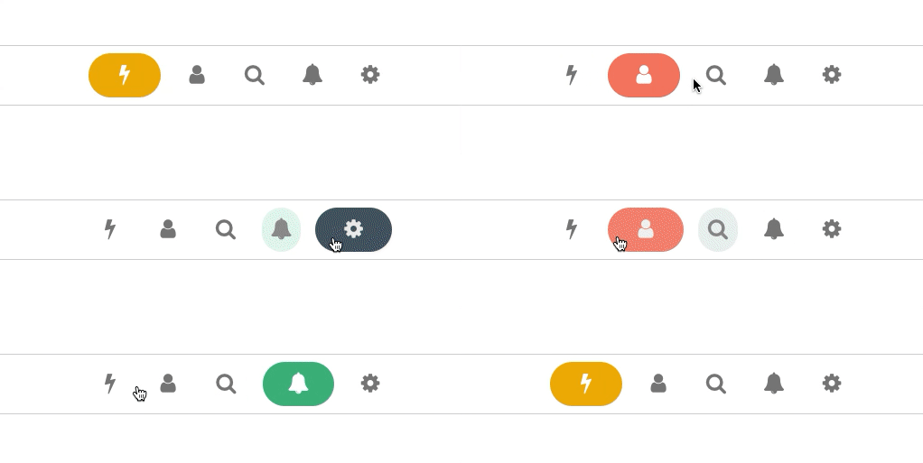
Navigation Animation
...
methods: {
  navigateTo(item) {
    const previousItem = this.$refs[`Item\_${this.currentRoute.id}`];
    const nextItem = this.$refs[`Item\_${item.id}`];
    this.currentRoute = item;
    this.animateOut(previousItem);
    this.animateIn(nextItem);
  },
  animateIn(item) {
    this.tweenColor(item, {
      backgroundColor: this.currentRoute.color,
      color: "white"
    });
    this.tweenSize(item, 64);
  },
  animateOut(item) {
    this.tweenColor(item, {
      backgroundColor: "white",
      color: "gray"
    });
    this.tweenSize(item, 32);
  },
  tweenColor(item, options) {
    TweenMax.to(item, 0.3, options);
  },
  tweenSize(item, width) {
    TweenMax.to(item, 0.7, {
      width,
      ease: Elastic.easeOut.config(1, 0.5)
    });
  }
}
...
This example heavily levarages javascript and the _g_sap library
source code
Differences with Vue 2
Animations are one of the [many affected features](https://v3-migration.vuejs.org/) by Vue 3 migration. The migration build is not reporting them as a breaking change which might confuse.
The old classes look like this:
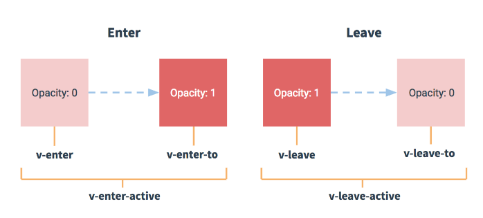
As you can see the .v-enter and .v-leave classes are replaced now by .v-enter-from and .v-leave-from . Additionally, the transition element props that control the animation class name changed from enter-class and leave-class to enter-class-from and leave-class-from .
You can find more information in the migration guide.
Conclusion
Vue provides a powerful way to incorporate simple or complex animations into your application. When used correctly, they can improve the overall user experience and make the interface more natural and professional. Finding a balance is always required since too many can have the opposite effect. So make sure not to overdo it.
Additional Resources
- Official Vue Documentation about transitions
- Awesome Vue — animations section
- Animation Techniques
- Reusable Vue 2 transition components vue2-transitions
- Lottie — popular 3rd party animation library
- Using CSS transitions from MDN
A live demo and the source code of every example are available. If you have any suggestions or ideas, please leave a comment below. And you are always welcome to create a pull request if you feel like it.
⭐️ Go build something awesome! ⭐️