Clean Layout Architecture for Vue Applications
Layouts are an essential pattern to reduce code repetition and create maintainable and professional-looking applications. If you are using…

Clean Layout Architecture for Vue Applications
Layouts are an essential pattern to reduce code repetition and create maintainable and professional-looking applications. If you are using Nuxt, an elegant solution is provided out of the box. But unfortunately, in Vue, the official documentation doesn’t address them at all. This often leads to sub-optimal and hacky solutions for a problem that should be similar across multiple applications.
After many attempts, I have concluded on an architecture that works well and scales without headaches. Let me demonstrate it using a small proof of concept.
The Requirements
First, let’s establish some rules that our layout architecture needs to fulfil:
- A page should declare the layout and the components of each section
- Changes to a page should not affect other pages
- If some parts of the layout are common across pages, they should be declared only once
Setting up Vue Router
Skip to the next section if you are already familiar with the vue-router
We will need to navigate between pages and that’s why we are going to setup vue-router. Vue-cli and vite scaffoldings offer the option to include it when creating a new project but in case you are not starting from scratch these are the steps to install it.
Install vue-router dependency
npm i -D vue-router@4Declaring the routes
const routes = [
  { path: "/", component: () => import("./pages/HomePage.vue") },
  { path: "/explore", component: () => import("./pages/ExplorePage.vue") },
];
Installing it as a plugin
import { createApp } from "vue";
import { createRouter, createWebHashHistory } from "vue-router";
import App from "./App.vue";
import routes from "./routes.ts";

const router = createRouter({
  history: createWebHashHistory(),
  routes,
});

const app = createApp(App);

app.use(router);

app.mount("#app");
Lastly, update App.vue to include only a single router-view
<template>
  <router-view />
</template>
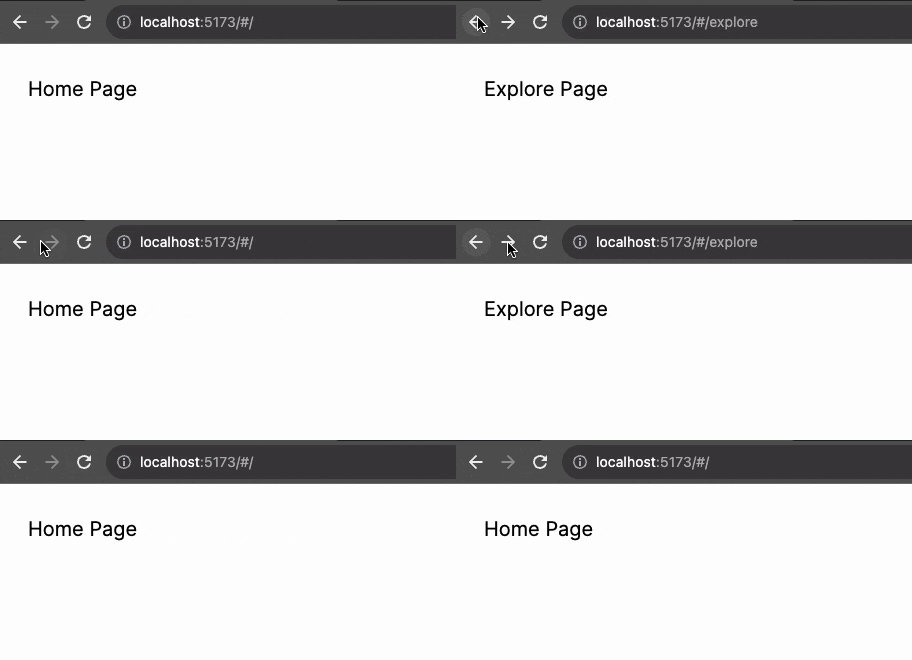
We can now navigate between two pages which is not that exciting since they are currently empty. Let’s change that.
The Pages
We will create the following pages: Home, Explore, Article and 404. And three layouts: three column, two column and a blank.
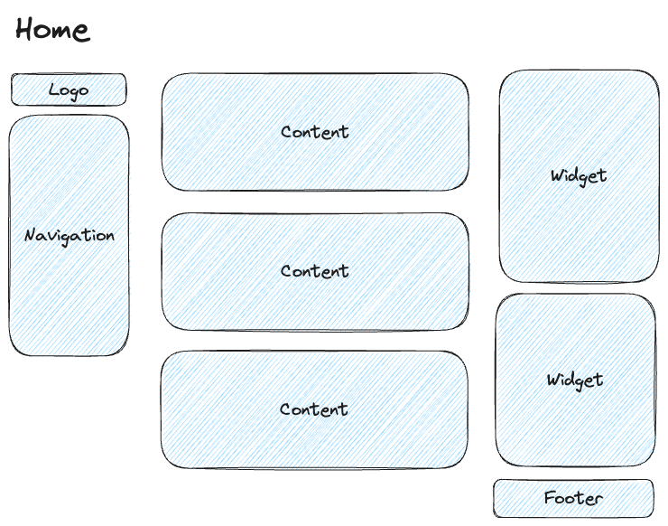
The home page is the typical 3 column layout that every popular social network uses. The first column contains the logo and navigation of the app which remains the same across every page that uses this layout. The same applies to the footer at the bottom right. The main content and the sidebar widgets change for every page.
Let’s implement this starting from the HomePage.vue component.
<script setup lang="ts">
import ThreeColumnLayout from "../layouts/ThreeColumnLayout.vue";
import ArticleCard from "../components/ArticleCard.vue";
import WidgetFriendSuggestions from "../components/WidgetFriendSuggestions.vue";
import useArticles from "../composables/useArticles";
const articles = useArticles().getArticles();
</script>

<template>
  <ThreeColumnLayout>
    <h2 class="text-3xl font-bold mb-4">Homepage content</h2>
    <ArticleCard v-for="article in articles" :article="article" />

    <template #aside>
      <WidgetFriendSuggestions />
    </template>
  </ThreeColumnLayout>
</template>
We use a ThreeColumnLayout component that we will implement soon. The default slot has a heading and a list of articles, which are the main content of the page. Additionally, we have a named slot called aside that is used to declare a widget.
The ThreeColumnLayout component [by common convention](/a-front-end-application-folder-structure-that-makes-sense-ecc0b690968b) is placed inside the folder /layouts It will use a grid container and utilize grid-template-areas to create a three-column layout.
Implementation details of the layout would be a concern of this component and not the page. Using flexbox, a [grid system](https://blog.logrocket.com/understanding-css-grid-by-building-your-own-grid/) or any other technique would be possible. The same applies if using a full-width, boxed or fluid layout.
This layout has 3 columns
- The first column will contain a hardcoded logo and navigation component
- The second column will create just the default slot and let the page decide what will be inserted
- The third column will contain the aside slot and the footer component that is common for every page.
<script setup>
import AppNavigation from "../components/AppNavigation.vue";
import AppFooter from "../components/AppFooter.vue";
import AppLogo from "../components/AppLogo.vue";
</script>

<template>
  <div class="three-column-layout">
    <header>
      <AppLogo />
      <AppNavigation />
    </header>

    <main>
      <slot />
    </main>

    <aside>
      <slot name="aside" />
      <AppFooter />
    </aside>
  </div>
</template>

<style scoped lang="scss">
.three-column-layout {
  display: grid;
  grid-template-areas:
    "header"
    "main"
    "aside";

  header {
    grid-area: header;
    margin-top: 30px;
  }
  main {
    grid-area: main;
    margin-top: 10px;
    padding: 20px;
  }
  aside {
    grid-area: aside;
    margin-top: 10px;
    padding: 20px;
  }

  @media (min-width: 768px) {
    grid-template-columns: 1fr 3fr 1fr;
    grid-template-areas: "header main aside";
  }
}
</style>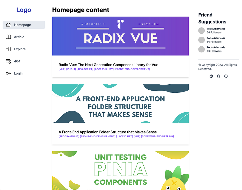
Creating a new page with the same layout will demonstrate how clean this approach is.
The article page will also have unique content inside the default slot and an additional widget on the sidebar:
<script setup>
import ThreeColumnLayout from "../layouts/ThreeColumnLayout.vue";
import WidgetRelatedContent from "../components/WidgetRelatedContent.vue";
import WidgetFriendSuggestions from "../components/WidgetFriendSuggestions.vue";
import { useRoute } from "vue-router";
import useArticles from "../composables/useArticles";
const article = useArticles().getArticle(useRoute().params.id);
</script>

<template>
  <ThreeColumnLayout>
    <h2 class="text-3xl font-bold mb-4">{{ article.title }}</h2>
    <div class="max-w-md" v-html="article.description"></div>

    <template #aside>
      <WidgetFriendSuggestions />
      <WidgetRelatedContent />
    </template>
  </ThreeColumnLayout>
</template>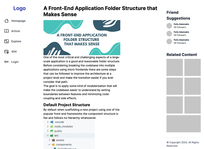
Two Column Layout
For the Explore page, we will create a two-column layout. The first column will be identical to the three-column layout, but the main section will occupy the rest of the screen and will have the footer at the bottom.
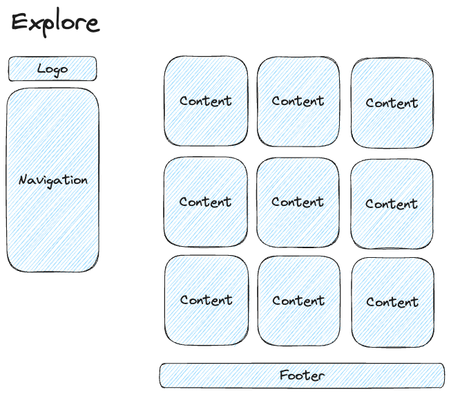
The implementation doesn’t look much different from the previous one. But this time we are using flex and flex-basis just to demonstrate a different way of creating CSS layouts. In a real-life scenario, all of the implementations should be using the same technique.
<script setup>
import AppNavigation from "../components/AppNavigation.vue";
import AppLogo from "../components/AppLogo.vue";
import AppFooter from "../components/AppFooter.vue";
</script>
<template>
  <div class="two-column-layout">
    <header>
      <AppLogo />
      <AppNavigation />
    </header>

    <main>
      <slot />
      <AppFooter />
    </main>
  </div>
</template>

<style scoped>
.two-column-layout {
  display: flex;
  @media (max-width: 768px) {
    flex-direction: column;
  }
}
header {
  flex-basis: 20%;
  margin-top: 30px;
}

main {
  flex-basis: 80%;
  margin-top: 10px;
  padding: 20px;
}
</style>
The explore page that uses this layout is quite simple
<script setup>
import TwoColumnLayout from "../layouts/TwoColumnLayout.vue";
import ExploreItem from "../components/ExploreItem.vue";

import useArticles from "../composables/useArticles";
const articles = useArticles().getExploreArticles();
</script>

<template>
  <TwoColumnLayout>
    <h2 class="text-3xl font-bold mb-12">
      Latest content on <a target="\_blank" href="https://dev.to/">Dev.to</a>
    </h2>
    <div class="grid lg:grid-cols-3 gap-6">
      <ExploreItem v-for="article in articles" :article="article" />
    </div>
  </TwoColumnLayout>
</template>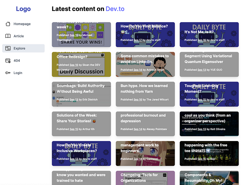
Blank layout
Lastly, let’s create a blank full-page layout that can be used on the 404 page.
<template>
  <main class="container my-24 px-6 mx-auto">
    <slot />
  </main>
</template>
It’s important to use a layout even if the implementation is simple, with just a centred container (using tailwind.css this time).
This way we can keep the page component lean and ensure multiple pages that use this layout look and behave the same.
<script setup>
import BlankLayout from "../layouts/BlankLayout.vue";
import PageNotFound from "../components/PageNotFound.vue";
</script>

<template>
  <BlankLayout>
    <PageNotFound />
  </BlankLayout>
</template>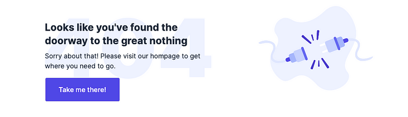
Conclusion
Layouts are a great tool to reduce boilerplate and maintain a professional-looking application. Combined with a comprehensive folder structure can lead to a codebase that everyone enjoys working with.
The project above is available on GitHub and you can test it live here.
Keep reading